Warning: Long post with thoughts that will span several topics
Gregory asked me to discuss my general selection process so I'll quickly walk through how this works. I'll try not to skip any important details but I do have to warn you that this is an entirely arbitrary process that isn't well thought out!
Upon ending the shoot all RAW files are imported into Lightroom (henceforth Lr) as DNG. This takes anywhere between 30 minutes and an hour on my MacBook 5.1. The first thing that I do when running through a shoot is to look over everything. Usually I'll delete the images that I know I can't use. These include pictures where the models eyes are half-open, lighting tests, trigger failures (none yet with the JrX!), strobe failures (human error usually), and whatever else that I know with 99.9% certainty that I can't use.
On the second pass, the selection process is in full effect. Here's an example:

What you should know is that we're outdoors. The light is coming from the sun at around 4:30PM and setting fast. It's partly cloudy and the sun is dodging in and out of clouds and giving me an exposure challenge during these frames. Let me quickly run through the thoughts for this particular set:
-I'm looking primarily at the face (first and foremost concern)
-How are the shadows reacting to Anna's face? Is the hair creating a distracting shadow across the right side of her face? At what angles does the light pass through her face?
-How much shadow is being cast onto the background? I was looking for "the more the better" since this is supposed to be hard light, but the clouds are making this difficult.
-In fact, the clouds are attenuating the hardness of my light (okay maybe attenuating wasn't the best word, how about mitigating?) and making me upset because I'm not getting the hard light effect I wanted
-In retrospect I should have moved the walls in a different angle in relation to the sun so that A) Anna didn't have to look into the sun and B) I could get better angles and shadows. Verdict: I'm an idiot.
-Looking for interesting pose.
-I really like the facial expression #7 (counting from left to right from the top) but the body is not interesting. Thus no white flag.
-Try not to block the cleavage. Give the people what they want.
-Which picture is going to give you something different than what you've already processed from the other set (of Anna's)?
-You'll see I have 2 white flags on this visible fraction of the entire set. These are now in my bag of candidates.
From here I narrow to view only those I've white flagged (Lr users know this and even with Aperture I'm sure this is doable and easy). I pretty much run through the same thought process again but this time I'm more picky. Anything slightly wrong or objectionable usually allows me to dismiss the frame. Here are the "runner ups":

The first one had a great upper half but a boring lower half. This was definitely the runner up and probably should have been "the one" of this set. For whatever arbitrary reason, I couldn't get myself to edit this one. The shadows were good and not distracting. The right hand placement was excellent but the left hand was odd and the bottom half of her body was disinterested in what the upper half of her body was doing.
The second image felt a little square and Anna's face didn't "speak" to me. It's a nice picture but it doesn't captivate me.
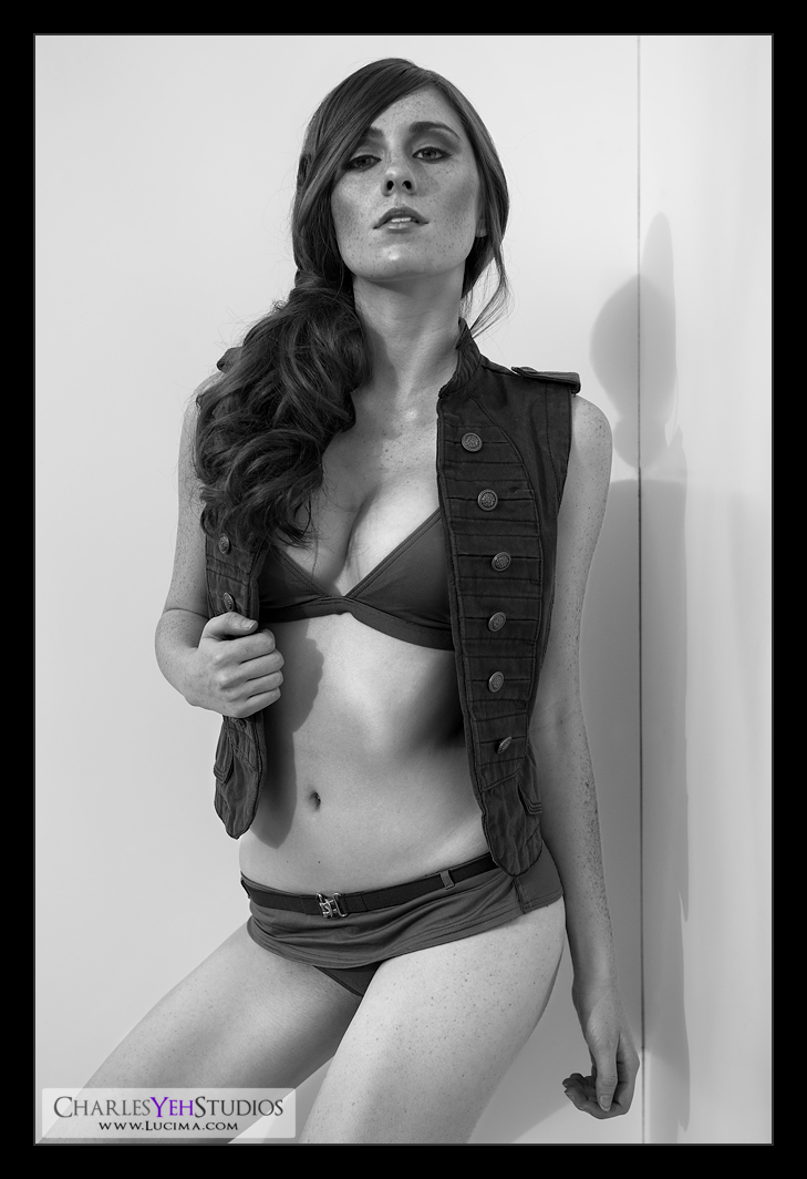
The third picture was interesting. I really liked Anna's expression and the face was spot-on. The sun was at least doing its job. But there were little things that were off about it. The vest is covering what she should be at least partially revealing. The bikini shorts are a little wedged. The hand positions are okay. The thing I couldn't get over was the hard shadow through the hair and onto the right side of her face.
So ultimately I picked this one because of the following reasons:

-I kinda knew Anna would like it
-The form and angles were good from waist down.
-The highlight on her chin caught my eye
-The shadows on her midsection gave me something to work with
-It was different and typically not the one I would choose
I told you this process was completely arbitrary! What did you expect? I am judge and jury!
Now onto the second half of the story. The retouching goodness. Again much like the last picture, this one was an "experiment". I wasn't sure about it when I first started so I ran some global adjustments to see if it had any potential. These included curves and levels adjustments.
In keeping with the color theme, I wanted to alter the eyeshadow. The pink was leftover from the last set and although the butterflies were gone, it was basically the same makeup. So to match the suit, I modified most of the pink eyeshadow (particularly in the middle) to green but left the edges slightly pink. This worked well.
But things changed. In exploring the extent that I could push the contrast for this image, I turned everything B&W and quite literally upside down. Out the window went all the hard work into making her eyeshadow green :) Basically I applied a B&W conversion and discovered that while this was good for the skin and suit, it made the vest and the hair too dark. So I masked out the vest and hair and applied another general desaturation layer to take care of that.
How did I know the hair and vest were too dark? Well, because the vest was brown and the hair was auburn, lowering the red and yellow channels via the B&W conversation also decreased the brightness of the hair and vest. This adjustment was good for the skin because it added tonality by making it darker, but the hair and the vest suffered and went too dark. So we needed to adjust these separately.
I'll skip to the end where things got interesting. Before I could take a screenshot of the layers adjustments, I closed the file and ended all potential adjustments that I might have made before uploading to the web. For reference, I usually leave files open for a few days after I upload just in case I need to made an adjustment and I never save them as .PSD with layers. All files are flattened then saved. Anyway, I typically don't process faces in B&W this dark so I'm still getting used to seeing Anna's face darker than usual. But maybe this was supposed to happen? That, in closing the file and ending all possible adjustments, I will have pushed the envelope of my own B&W conversion? Maybe it's better this way? I dunno.
Anyway, I skipped a whole lot of small talk and tried to cut to the chase so if I left anything out that needed to be discussed let me know :)
Camera: D3/24-70mm f/2.8G @70mm, 1/640th, f/4.5, ISO200
Strobist: Southern Californian sun (4:30PM) from upper camera left rear
Model/wardrobe: Anna K. Mason
Makeup: Kelli Zehnder
Hair: Michelle Green
Awesome stuff, Charles. This is exactly what I was looking for. Now if I can just find Floor 7 1/2 and that that portal for "Being Charles Yeh." I guess your blog will have to do until then. ;-)
ReplyDeleteLOL :) Thanks Gregory. There's nothing special to this stuff. It's just practice. Pretty soon you'll create your own workflow and it'll be totally unique and personal to your own tastes! :)
ReplyDeleteLet me know if you find anything interesting though. I'm all ears!
Charles